
15 Graphs to Explain 2015 Real Estate
As you plan for the coming year, it may be helpful to review what transpired in 2015. Below are 15 charts describing real estate sold in 2015 in Brookline, Newton, Cambridge, and a core section of Boston (from the original Shawmut Peninsula, west through Beacon Hill, Back Bay and up through Kenmore). This analysis is based on 3,359 condos and single-family homes reported sold in the MLS.
There is at least one key takeaway: if you are considering buying or selling a home in 2016, now is the best time to start planning. Please give me a call, text, or email and I’ll be happy to advise you on what preparation you should be doing now.
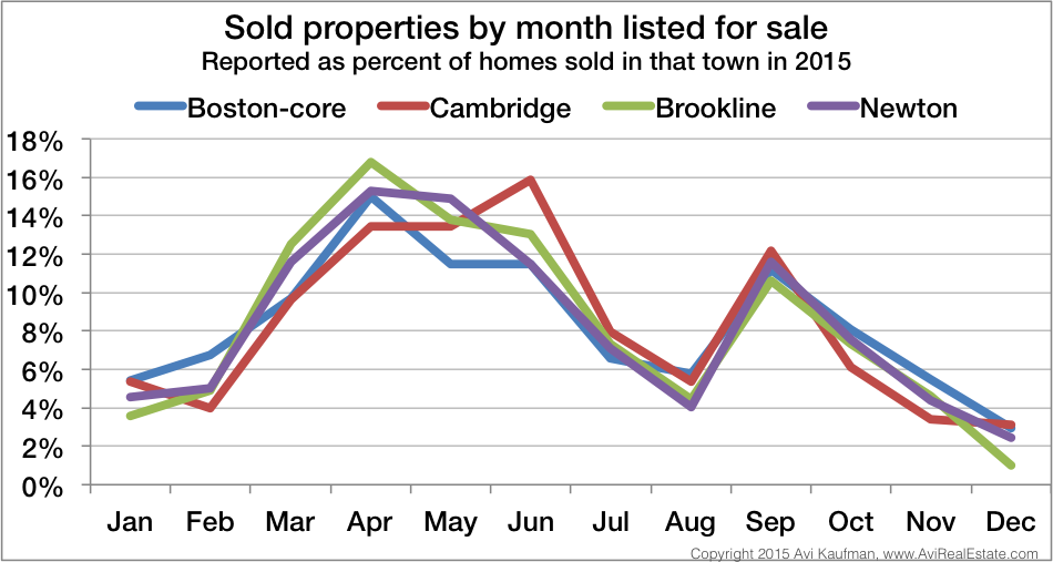
1. Across all areas, most homes were listed in the spring, followed by a quieter period in the middle of the summer, and then a bump of activity in September.
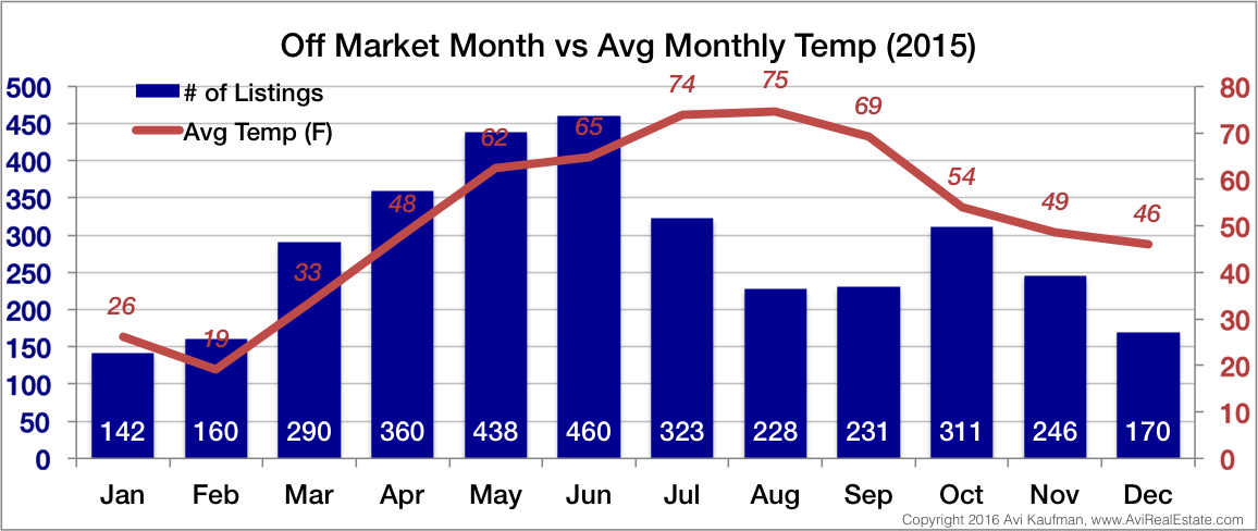
2. Home buying activity, represented here by when properties went under agreement, roughly tracked the weather. There was less activity in the dead of winter when it was unpleasant outside and in the dog days of summer when many people go on vacation.
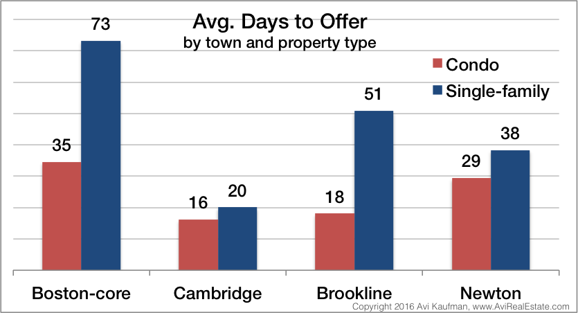
3. Single-family homes were more affected by home buying seasonality than condos. It took almost twice as long for single-family homes listed in August to receive offers than single-family homes listed in April.
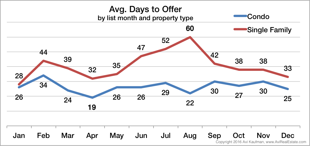
4. On average, condo listings found buyers in a matter of weeks, not days. Single-family homes tended to take a bit longer.
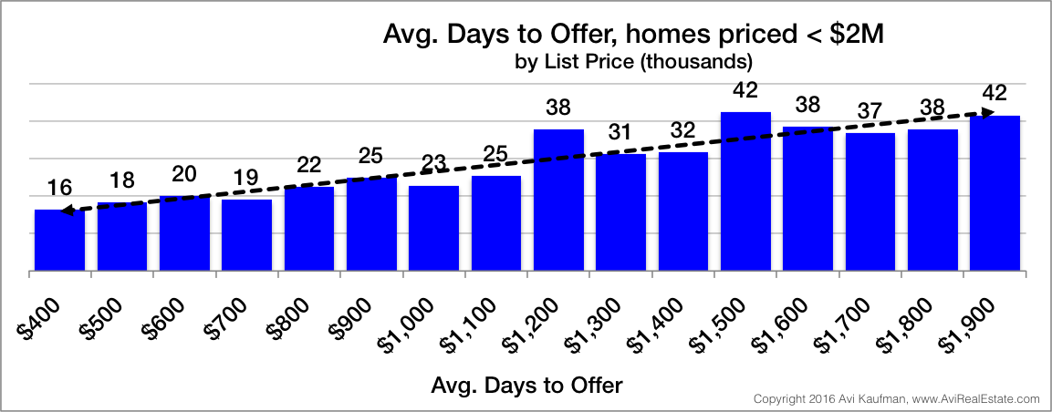
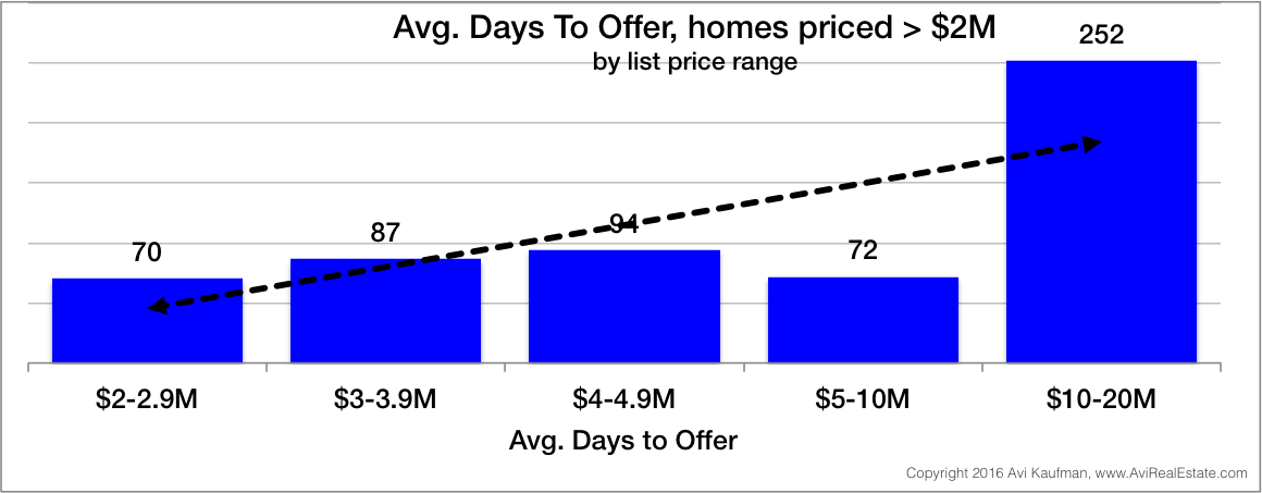
5-6. The higher the list price, the longer it took on average for properties to receive acceptable offers. This is likely due to the fact that there are more prospective home buyers at the lower price points.
7. Properties sold in the busy season were more likely to receive offers above their list price. This is often driven by competitive bids when more than one buyer puts in an offer.
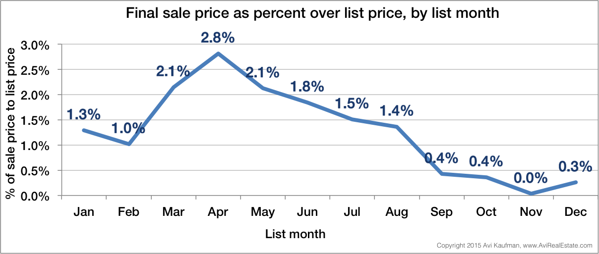
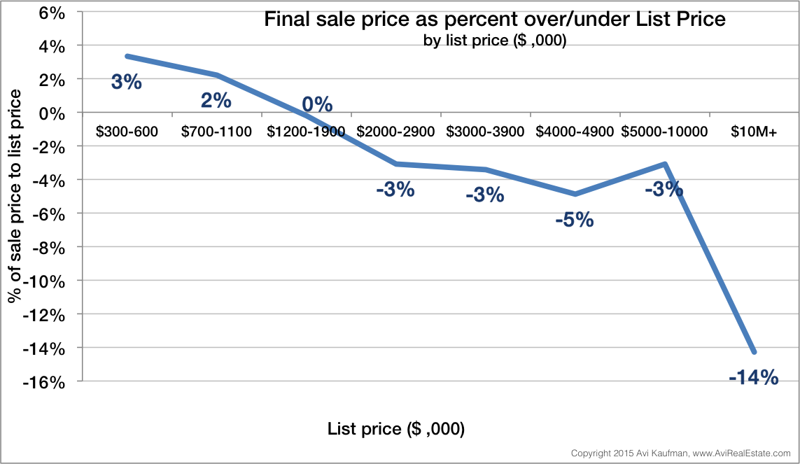
8. Overall, lower priced properties were more likely to be sold above list price, again likely due to the larger pool of buyers competing for these properties. Higher priced properties were more likely to be sold below list price.
Housing Stock
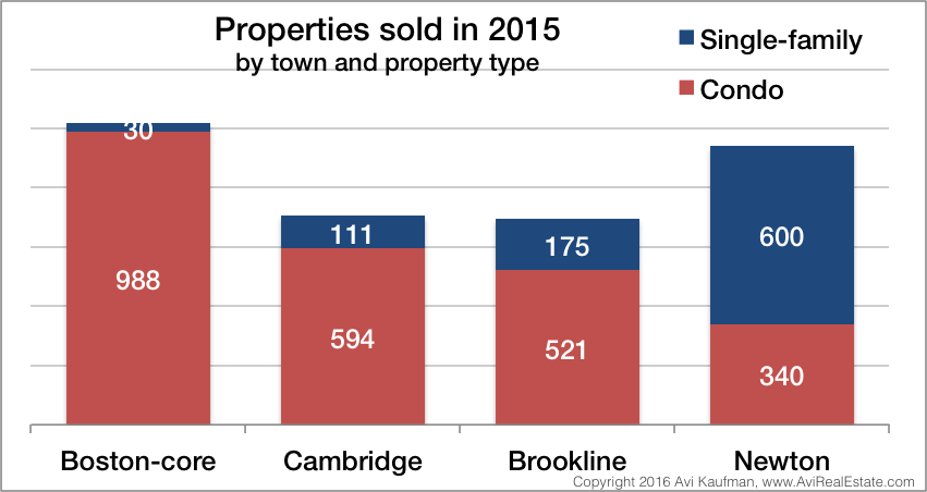
9. The ratio of condos to single-family homes sold was highest in Boston and lowest in Newton, reflecting the more suburban housing stock as you get farther from the city.
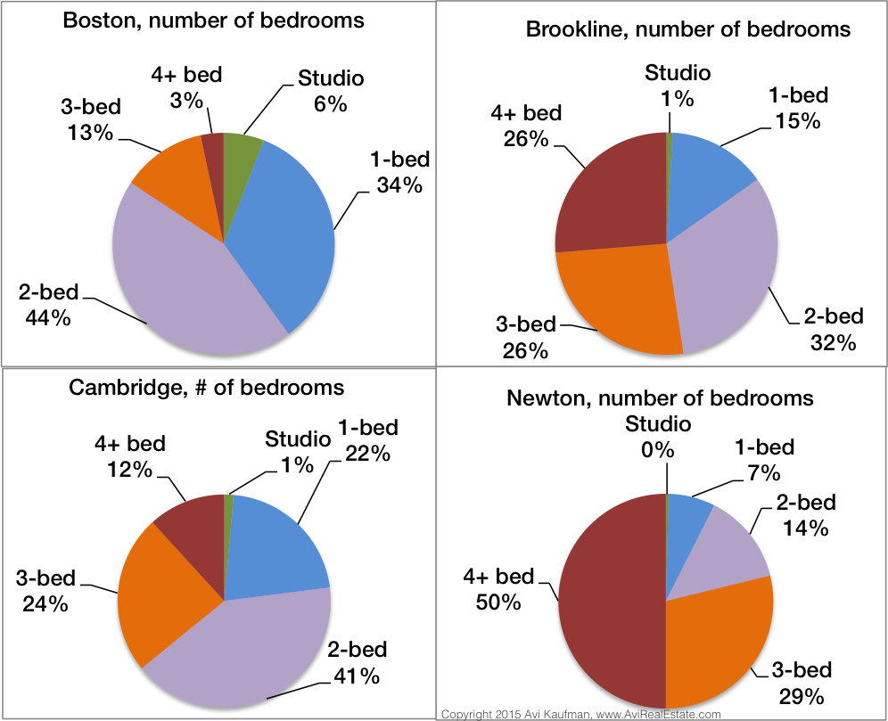
10-13. The average number of bedrooms gives a glimpse of the different housing stock in each town. As you might expect, the more suburban communities have larger homes.
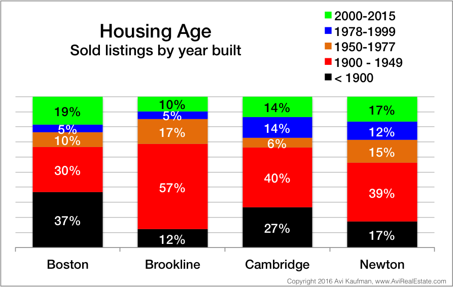
14. Newer housing was available for sale, but older housing still predominates.
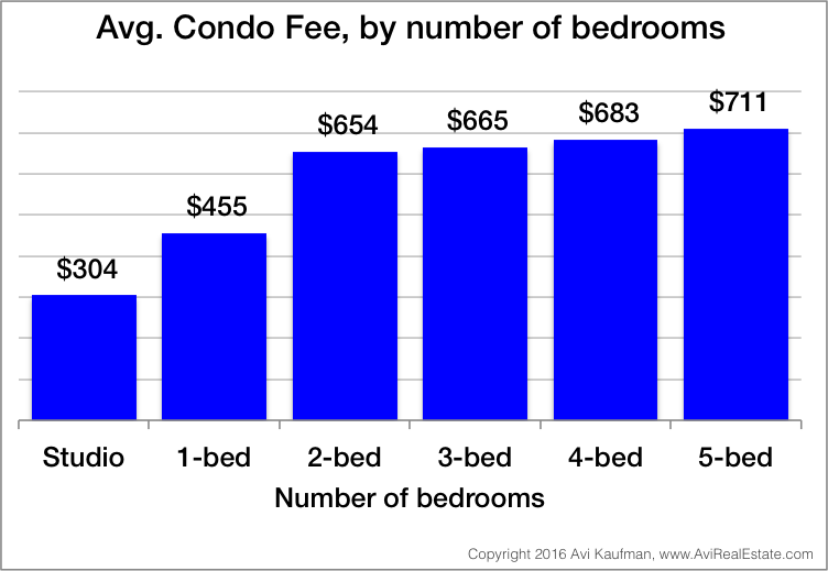
15. Condo fees can be a significant expense on top of a mortgage payment; be sure to budget for it.
Please do not hesitate to contact me if you have questions on any of these charts, or would like more information on your town!
Questions? Email me and let's set up a time to discuss your real estate needs.
AVI KAUFMAN is a top broker who lives in Brookline, Massachusetts and works there and surrounding communities, assisting buyers and sellers of residential property. He is building a unique practice dedicated to serving the best interest of his clients - see how he's different.